Blog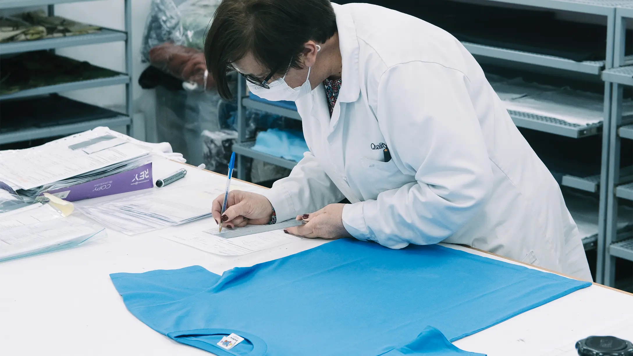
15 June 2026
Your blue isn't my blue.
You send a colour and expect it back exactly. But colour shifts the moment it meets a material — here's why, and how close we can actually get.
You pick a colour on your screen, send us the code, and expect that exact colour back on your hoodie. Fair enough — that's how it should work.
But colour isn't a fixed value. The moment it leaves the screen and meets a real material, it starts to shift. So before you sign off on a shade, here's what actually happens to it.
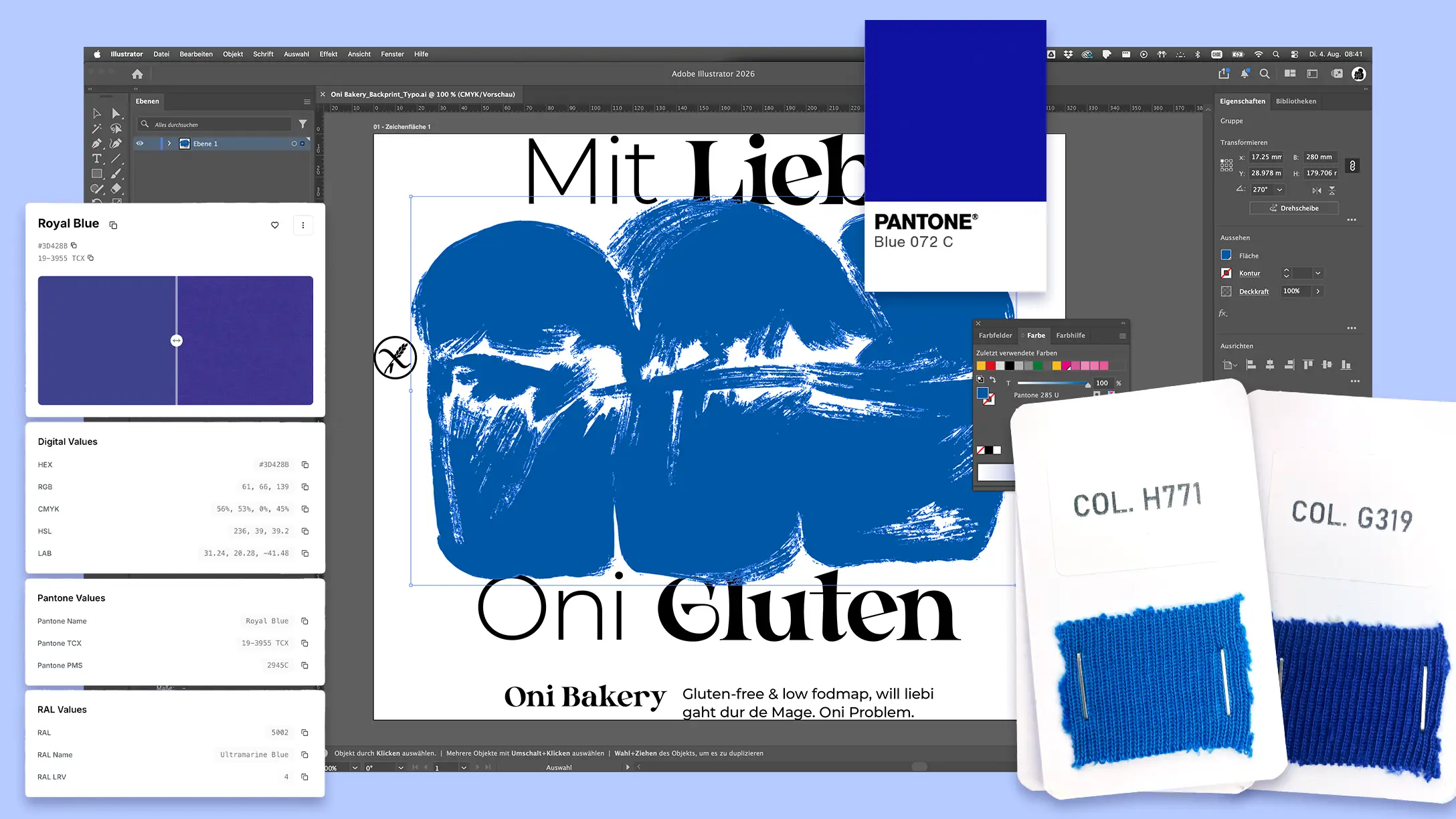
A colour on a screen isn't a colour on cotton.
A screen makes colour out of light — it glows. Fabric makes colour out of dye sitting in fibre — it reflects. Those are two different physical things, and there's no clean way to translate one exactly into the other.
That's the whole reason Pantone exists: instead of trusting a screen, everyone points at the same physical reference. For textiles that's the TCX system — actual cotton swatches, each dyed to a fixed standard. So we don't match your colour to a pixel. We match it to a swatch you can hold.
If you want to look for yourself: ColorBook lets you go through the TCX range and search by name or code — we use it too. It's still a screen, so send us what you land on and we'll hold it against the real swatch.
The same dye behaves differently on every fibre.
Here's where "your blue" and "my blue" split apart. Give the exact same dye to different fabrics and you get different results.
Cotton drinks the colour in, so it reads a little deeper and more matte. Polyester holds it more on the surface, so it looks brighter. A cotton-poly blend can come out of a single dye bath as two slightly different shades at once — the cotton pulling one way, the polyester the other. And texture changes it again: a smooth surface bounces light straight back, a raised or ribbed one traps it and reads darker.
So a colour isn't "wrong" when it looks different on a hoodie than on a cap. It's just a different material doing what materials do.
Printed and knitted-in are two different colours, too.
It's not only the fabric — it's the method. A printed logo uses ink; a dyed or knitted-in colour uses textile dye. Those are two separate pigment worlds — Pantone even keeps separate books for them — so the same brand blue printed on a chest and knitted into a sock won't be a perfect twin. We got into the sock version of this in our post on logo methods; the same logic runs through colour.
With socks, the colour starts in the yarn.
A t-shirt gets its colour from dyeing the fabric, so a lab dip can be pushed toward your exact shade. A knitted sock works the other way round: the colour is already in the yarn before a single stitch is made.
So instead of dyeing to your Pantone, we match to our supplier's yarn cards — the range of yarn colours that actually exist — and pick the closest one to your reference. Sometimes it lands spot on. Sometimes the honest answer is "this is the nearest yarn we can get," and we tell you which way it leans before you commit.
Either way, we work off something physical — not a screen.
When we're dyeing fabric, the dye house makes a small test first — a lab dip — and we hold it against the physical Pantone standard. When we're matching yarn, we compare your colour against the yarn card. Either way the reference is a real thing you can see, not a pixel — and we check it under standardised daylight, not under whatever light happens to be in the room, because the same colour can read as two under a shop light versus daylight.
What we can promise is honest: we get your colour as close as the material allows, against a real reference, checked in the right conditions. What nobody can promise is a pixel-perfect match across every fabric and every method — because a perfect match across all of them was never actually possible.
Picking a colour for your merch?
The goal isn't to match a pixel — it's that your brand still feels like your brand on the real product. We'll tell you upfront where a material might pull it.
AG
Alina
blaenk studio